The letter R was wrong.
That was how Talia Quist knew the photograph was important.
Everything else about it seemed ordinary enough.
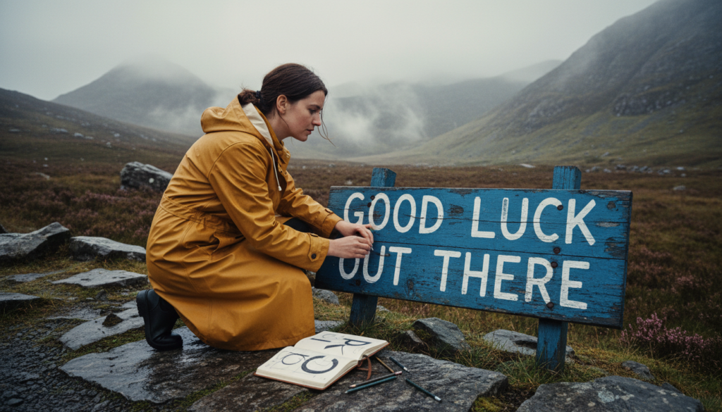
An abandoned roadside sign.
A faded blue background.
White capital letters.
A gravel lay-by beside a mountain road.
The words:
GOOD LUCK OUT THERE.
The photograph had been circulating online for three days.
Nobody knew who’d painted the sign.
Nobody knew why it stood beside a disused road.
And thousands of people were asking the same question.
What font is this?
Most suggested one of several familiar condensed sans-serif typefaces.
A few insisted it was a modified industrial alphabet.
One person claimed it was a rare design used on military equipment in the 1960s.
Another said it was generated by artificial intelligence.
Talia knew none of those explanations was convincing.
The R had a peculiar leg.
It descended from the bowl at an angle, then bent sharply outward as though the letter had changed its mind halfway to the baseline.
The G was unusually open.
The U had a flat bottom.
And the three O’s in the phrase weren’t identical.
Not even close.
One was nearly circular.
One leaned slightly to the right.
The third was narrow, with a subtle flattening along its upper curve.
Whoever had made the sign had not simply typed the words and transferred them onto metal.
The letters had been constructed individually.
Talia enlarged the photograph until the pixels became ugly.
Then she leaned back.
She was thirty-four, worked as an independent type designer, and had spent the previous six months wondering whether she’d chosen the wrong profession.
She designed alphabets.
Entire systems of letters, numbers, punctuation marks, and symbols.
She considered how an a sat beside an r.
How much space belonged between T and o.
Whether a lowercase g should have one storey or two.
Whether a typeface intended for small screens could remain readable when rendered at tiny sizes.
She thought about things most people never noticed until they went wrong.
And she loved it.
Unfortunately, love did not consistently pay the rent.
Her largest client had recently canceled a contract.
Two smaller projects had stalled.
An agency had asked her to submit a complete design proposal without compensation, describing the request as an opportunity to demonstrate enthusiasm.
Talia had replied that her enthusiasm was fully available after the deposit cleared.
The agency had not answered.
Now she sat in her apartment above a dry cleaner, studying an image of a sign in the mountains.
Her telephone rang.
She glanced at the screen.
An unfamiliar number.
She answered.
“Talia Quist.”
A man spoke.
“Ms. Quist? My name is Rowan Beck. I’m calling from Vantage & Vale.”
She recognized the name.
A prestigious branding agency.
Large corporate clients.
Expensive offices.
More money spent on coffee than Talia’s monthly grocery budget.
She sat upright.
“Hello.”
“We’ve seen your lettering work.”
“Thank you.”
“And we have a project that might suit you.”
Talia looked at the photograph.
The strange R stood in the center of her screen.
“What kind of project?”
“A custom typeface inspired by an existing piece of signage.”
She felt a small thrill.
“Do you have a reference?”
“Yes.”
A pause.
“It’s rather unusual.”
Then an email arrived.
She opened it.
The mountain sign.
GOOD LUCK OUT THERE.
Talia smiled.
Of course.
Rowan continued.
“A travel company wants to use this lettering for a major campaign. Posters, vehicles, merchandise, perhaps a digital product.”
She looked at the photograph.
The faded paint.
The hand-shaped letters.
“Do they know who created it?”
“Not yet.”
“Then we need to establish that before we talk about reproducing it.”
A pause.
“Naturally.”
Talia recognized the hesitation.
The corporate version of could we perhaps avoid the inconvenient part?
Rowan continued.
“The campaign launch is in three weeks.”
She stared.
“Three weeks?”
“We need an initial alphabet much sooner.”
Talia looked at the sign.
There were only ten different letters in the phrase, depending on how the forms were counted.
A useful typeface would require far more than that.
She would need to design the missing characters.
Establish consistent proportions.
Test spacing.
Add punctuation and numerals.
Determine how much of the original character could be preserved without becoming unreadable across different uses.
And before any of that, she needed to know whether the original artist could be identified and whether the proposed use had permission.
“That’s an ambitious schedule.”
“We pay appropriately.”
Rowan mentioned a figure.
Talia nearly dropped her telephone.
It was enough to cover her rent for months.
Enough to replace her aging computer.
Enough to breathe.
She looked again at the strange R.
Then asked, “Where was the photograph taken?”
“We believe somewhere in the northern mountains.”
“That’s rather broad.”
“There’s a location tag.”
He sent it.
A remote stretch of road nearly seven hours away.
The old Bracken Pass.
Talia had never been there.
She studied the coordinates.
Then said, “I need to see the sign.”
Rowan hesitated.
“In person?”
“Yes.”
“Is that necessary?”
“If you want an accurate recreation, yes. The photograph doesn’t show enough detail to distinguish painted irregularities from image distortion.”
A pause.
Then:
“All right.”
“And we need to establish the work’s origin and permissions.”
Another pause.
“Understood.”
Talia didn’t entirely believe him.
But she accepted a paid research phase with written terms and arranged the trip.
The next morning, she packed a camera, sketchbook, measuring tape, portable scanner, and two pairs of shoes.
Then she borrowed her neighbor’s car.
Her neighbor, Fenn Alder, stood beside the vehicle with his arms folded.
It was a small red hatchback that had endured several minor accidents and one serious disagreement with a supermarket trolley.
He pointed toward the dashboard.
“If the engine light comes on, don’t panic.”
Talia stared.
“Is it likely to?”
“It always comes on.”
“Why?”
“Because the car is emotionally expressive.”
She closed her eyes.
“Fenn.”
“It’s fine. The mechanic checked it last month.”
She looked at him.
“What did the mechanic say?”
“That the light was still on.”
Talia considered renting another vehicle.
Then remembered her bank balance.
She took the keys.
“Thank you.”
Fenn smiled.
“Where are you going?”
“To identify a font.”
He stared.
“Seven hours away?”
“Yes.”
He looked bewildered.
“Can’t you just use one of those apps?”
Talia placed her bag in the car.
“I tried.”
“And?”
“It identified six different typefaces, none of which matches the letters.”
Fenn frowned.
“So why drive there?”
She looked toward the road.
Then smiled.
“Because the sign knows something the photograph doesn’t.”
Fenn considered.
“That’s the most designer thing anyone has ever said.”
She laughed.
Then started the car.
The engine light came on.
Of course it did.
The drive north took eight hours.
Not because the route was particularly difficult.
Because the car could not climb a hill without expressing a deep personal objection.
Talia stopped twice for coffee.
Once for fuel.
And once because a herd of sheep had decided that the road belonged to them.
She photographed the sheep.
They looked unimpressed.
By late afternoon, she reached Bracken Pass.
The road wound between dark hills covered in heather and low trees.
A small reservoir lay beneath the eastern ridge.
The air smelled of wet stone.
The original highway had been abandoned after a new route opened through a nearby valley.
The old road was still accessible in places, though barriers marked sections closed to vehicles because of deteriorating surfaces and structures.
The sign stood at the entrance to a lay-by, outside the restricted section.
It was taller than she’d expected.
Nearly twelve feet wide.
Mounted on two steel supports.
Its blue paint had faded toward gray.
White lettering stretched across its face.
GOOD LUCK OUT THERE.
Talia parked.
Stepped into the cold air.
Then stood before the sign for a long time.
The photograph had not prepared her.
The letters were extraordinary.
Not elegant in the conventional sense.
Not perfectly balanced.
But full of decisions.
The horizontal bars ended in different ways.
Some were blunt.
Others slightly rounded.
The G opened toward the right, with an inward stroke that bent down rather than standing straight.
The U had almost squared corners.
And the R—
She walked closer.
The R was stranger than she’d realized.
The leg was not merely bent.
It consisted of two strokes painted at slightly different angles, with one overlapping the other.
Talia photographed it.
Then examined the O’s.
Each was shaped differently.
One was narrower.
One slightly tilted.
The third had a heavy patch of paint near the bottom.
She smiled.
“Whoever you are,” she whispered, “you were doing something interesting.”
A voice spoke behind her.
“That’s a dangerous thing to say about my brother.”
Talia turned.
A woman stood beside the gravel verge.
She was perhaps seventy-five, wearing a dark coat, walking boots, and a knitted hat that had clearly been constructed without concern for symmetry.
She carried a small paper bag.
Her expression was suspicious.
Talia lowered the camera.
“Sorry?”
The woman nodded toward the sign.
“My brother painted that.”
Talia felt her heart leap.
“Really?”
“Mostly.”
The word made her pause.
“Mostly?”
The woman stared at her.
“Who are you?”
“Talia Quist. I’m a type designer.”
“A what?”
“I design fonts.”
The woman looked at the sign.
Then back at Talia.
“Well, there’s no font there.”
Talia smiled.
“That’s what I suspected.”
The older woman’s expression softened slightly.
Then she looked at the camera.
“Are you another one of the internet people?”
“Possibly.”
“There’s been a steady procession of them.”
She sighed.
“One man stood in front of the sign for forty minutes pretending to cry.”
Talia blinked.
“Why?”
“He said it was content.”
The woman looked profoundly offended.
Talia laughed.
Then introduced herself properly.
The woman’s name was Edda Pell.
She lived in the village below the pass.
Her brother, Hal Pell, had painted the sign forty-nine years earlier.
He had died the previous autumn.
Talia felt a quiet disappointment.
She had imagined finding the artist alive.
Asking about the letter shapes.
The choices.
The irregularities.
Why the R was bent.
Why the O’s differed.
Then Edda lifted the paper bag.
“Well, since you’ve come all this way, you’d better have a biscuit.”
Talia stared.
“Sorry?”
“I don’t intend to explain a forty-nine-year-old sign while standing in the cold.”
She pointed toward a small cottage visible down the hill.
“Come on.”
Talia looked at the sign.
Then at Edda.
“You’re inviting me to your house?”
“Yes.”
“Why?”
The older woman frowned.
“Because you’ve asked a question.”
She turned toward the cottage.
“And I’m tired of people guessing the answer.”
Edda’s cottage contained thirty-seven clocks.
Talia counted them while the older woman made tea.
Some hung on the walls.
Others stood on shelves.
One occupied the windowsill beside a row of elderly houseplants.
Another ticked inside a glass dome.
None showed precisely the same time.
Talia watched them with mounting interest.
“Do they all work?”
“Most.”
“Why are the times different?”
Edda placed two mugs on the table.
“Because I haven’t adjusted them.”
Talia smiled.
“Doesn’t that bother you?”
“No. I own a wristwatch.”
She sat down.
“Now. Tell me what you want with Hal’s sign.”
Talia explained the agency.
The travel campaign.
The plan to create a complete typeface.
The money.
She didn’t mention the amount until Edda asked.
When she did, the older woman put down her biscuit.
“Good heavens.”
Talia nodded.
“I know.”
“And they want to use those letters to sell holidays?”
“Travel products, primarily.”
Edda looked toward the window.
“Interesting.”
The word was not encouraging.
Talia waited.
Finally, Edda said, “I’d better tell you what happened.”
She crossed to a cupboard.
Removed an old cardboard box.
Placed it on the table.
Inside were photographs, notebooks, newspaper cuttings, and several sheets of paper covered in lettering experiments.
Talia leaned forward.
One photograph showed a much younger Edda beside a group of road workers.
The road was new.
The hills bare.
A steel sign stood behind them, its surface still unpainted.
“1977,” Edda said. “The old road was open then. Difficult in winter. Beautiful in summer. People came through here without properly understanding how quickly conditions could change.”
Talia nodded.
Edda took another photograph.
There was Hal, perhaps thirty, standing beside the sign with a paintbrush in his hand.
He looked cheerful.
Beside him stood several other workers.
Some younger.
Some older.
One wearing overalls with a patch on the knee.
Another holding a bucket of paint.
“Hal was a sign painter,” Edda said. “A good one. Worked on shopfronts, vehicles, fairground signs, whatever people would pay him for.”
Talia examined the lettering sketches.
“Did he design this alphabet?”
Edda laughed.
“He designed the layout.”
“What’s the difference?”
“Quite a lot, in this case.”
She moved the photograph closer.
“That sign was a joke.”
Talia looked up.
“A joke?”
“The road authority had put up more serious warnings. Drivers were supposed to use their judgment and follow closure notices. But the workers were tired of people asking whether the mountain would behave itself.”
She smiled.
“One day, Hal said the only honest thing to tell them was good luck out there.”
Talia smiled.
“So he painted it.”
“Not exactly.”
Edda reached into the box.
Produced another photograph.
The workers stood along the sign.
Each held a paintbrush.
One was kneeling.
Another balanced on a ladder.
A little girl stood at the far end with paint on her nose.
Talia leaned closer.
“Who’s the child?”
“Me.”
She looked up.
“You?”
“Seventeen years younger than Hal. A nuisance, apparently.”
Talia glanced between Edda and the photograph.
“How old were you?”
“Twenty-seven.”
Talia stared again.
Then laughed.
“I thought you were the little girl.”
Edda smiled.
“That’s my daughter, Ruth.”
She pointed to herself.
A young woman with short dark hair stood beside the sign, holding a paint tin.
Talia examined the group.
“How many people painted it?”
“Fourteen, if you count the ones who only filled in sections.”
Her heartbeat quickened.
“So the letters…”
“Weren’t all Hal’s.”
Edda nodded toward the sketches.
“He marked the basic positions. Established the height. Drew some of the outlines. Then everybody joined in.”
Talia stared at the photograph.
One man was painting a G.
Another an O.
A woman stood on a ladder working on the U.
Somebody else was filling the counter of the R.
“Why?”
“Because it was Friday.”
Talia laughed.
Edda looked amused.
“And because the sign was supposed to be temporary. A bit of amusement before the weekend. Nobody imagined people would be photographing it half a century later.”
Talia looked at the photograph.
Talia looked toward the box.
The papers were covered in sketches.
Some letters were carefully measured.
Others had been changed by hand.
She lifted one sheet.
A capital R.
Its leg bent sharply outward.
There were two competing sketches.
One with a straight diagonal leg.
One with a bent one.
Talia pointed.
“Who painted the R?”
Edda smiled.
“Two people.”
“Who?”
“Hal drew it. Then his friend Mace came along and said it looked too ordinary.”
She laughed.
“Mace had lost part of a finger in an accident years earlier and found certain brush movements awkward. He added the lower stroke in a way that felt natural to him. Hal liked the result.”
Talia looked toward the photograph.
A man with a broad smile stood beside the letter.
She studied the R again.
The overlap.
The bend.
The abrupt change of direction.
Not a flaw.
A decision shared between two people.
She turned to the O’s.
“And these?”
Edda leaned forward.
“Those were a competition.”
“A what?”
“Everyone claimed they could paint a better circle than Hal. Three of them tried.”
Talia laughed.
“Who won?”
“Nobody. Hal refused to judge.”
The older woman smiled.
“Ruth painted one of the little details in the last O. Hal was furious because she’d put her hand in the wet paint. Then he decided it looked better that way.”
All those people.
All those hands.
And a sign the internet wanted to assign to a single font.
Edda opened another envelope.
Inside was a photograph of the completed sign on the day it was installed.
Bright blue paint.
Clean white letters.
A group of workers standing beneath it.
Some laughing.
Others looking exhausted.
Hal sat on the steel support with one boot hanging over the edge.
Talia looked at the photograph for a long time.
Then asked, “Did he ever make a full alphabet?”
Edda shook her head.
“No.”
“Did he reuse the lettering?”
“Not that I know of.”
“So there isn’t a font to identify.”
“No.”
Edda looked toward the window.
Then said, “That’s why all these people coming up here annoy me.”
Talia frowned.
“Why?”
“They keep asking what the letters are called. As though giving something a name means they’ve understood it.”
The words stayed with her.
Talia looked down at the photograph.
For years, she had earned her living transforming individual letters into systems.
A typeface needed consistency.
Relationships.
Rules.
A logic that could survive beyond the original word.
But this sign was not a system in that sense.
It was fourteen people making one sentence.
Each letter carried a small piece of the person who had helped paint it.
The irregularity wasn’t something to correct.
It was part of the story.
Edda watched her.
“Can you still do the job?”
Talia looked toward the photographs.
She thought about the fee.
The rent.
The computer she needed.
The client waiting for an alphabet.
Then she said, “Not the job they described.”
Edda nodded.
For a moment, she seemed disappointed.
Then Talia continued.
“But perhaps something different.”
She took out her notebook.
Opened a clean page.
And began drawing.
Two days later, Talia sat in a video meeting with Rowan Beck and three senior members of the branding team.
She had prepared a presentation.
Not a dramatic one.
No mysterious music.
No sweeping statements about the soul of typography.
Just photographs.
Notes.
Evidence.
And a proposal.
Rowan looked at the first slide.
“What’s this?”
“The original sign in 1977.”
He leaned forward.
“Excellent. So you’ve identified the designer.”
“Not one designer.”
He frowned.
Talia explained the history.
The workers.
Hal’s layout.
The overlapping strokes.
The three O’s.
The R painted by two people.
The child contributing a detail.
How the lettering had been made as a one-off piece rather than produced from a standardized typeface.
One of the agency directors interrupted.
“But surely you can reproduce it.”
Talia nodded.
“Technically, I can draw a digital alphabet inspired by those forms.”
“Then what’s the problem?”
“There are several.”
She changed slides.
The enlarged R appeared.
Then its two original sketches.
“First, we shouldn’t claim this is an existing font we’ve identified. It isn’t. Second, the sign’s authorship is collaborative, and the rights and permissions for reproducing it commercially need proper review.”
The director frowned.
“That sounds complicated.”
“It is.”
“Can’t we just call it vintage industrial lettering?”
“You can describe its appearance that way. That doesn’t establish permission to copy it.”
Rowan leaned forward.
“What’s your recommendation?”
Talia took a breath.
She had spent the previous evening preparing for this question.
She had also spent several hours calculating how long she could afford to live without the remaining contract fee.
The answer was unpleasant.
She looked toward the camera.
“Commission an original typeface that captures the general qualities you like—sturdy proportions, generous counters, a hand-built character—without tracing the distinctive letterforms.”
One director looked skeptical.
“Will it have the same personality?”
“It will have its own.”
Silence.
Talia continued.
“If you want to tell the story of the original sign, do it accurately. Work with the people connected to it, obtain the necessary permissions, and credit the history rather than treating the photograph as free material.”
Rowan looked at the slides.
Then asked, “Can you still meet the deadline?”
Talia hesitated.
“Not the full original scope in the time you’ve allowed.”
The director sighed.
Talia felt her stomach drop.
Then she said, “I can deliver a limited, properly tested display-lettering set for the campaign’s initial materials. A more complete family would require a later phase.”
Rowan looked toward the others.
Nobody spoke for several seconds.
Then he said, “Send us a revised scope and budget.”
Talia blinked.
“You’re interested?”
“In discussing it.”
She smiled faintly.
“That’s a beginning.”
The meeting ended.
Talia sat staring at her blank screen.
She had not won.
The agency might reject the proposal.
The client might choose somebody willing to reproduce the sign without asking questions.
The paid research phase was secure under the agreement, but the larger project remained uncertain.
She leaned back.
Then laughed softly.
For years, she’d worried that her profession was becoming a contest to produce the closest possible imitation at the lowest possible price.
Now she had spent three days learning why an imitation might be the least interesting answer.
She looked toward her sketches.
The new alphabet was beginning to take shape.
It was not Hal’s.
Not Edda’s.
Not Mace’s.
Not the collective lettering on Bracken Pass.
It was hers.
And for the first time in months, she was excited to find out what it might become.
The revised commission was approved a week later.
Not without negotiation.
The fee was smaller than the original proposal.
The schedule more realistic.
The agency agreed to separate the new typeface commission from any use of the historic sign’s imagery and history.
Talia still needed to work hard.
Very hard.
She made drawings.
Tested spacing.
Designed capitals.
Numbers.
Punctuation.
The lower-case forms required more thought than she’d expected.
She built a typeface with broad, open shapes and sturdy strokes intended to remain readable in large display applications.
She tested it in mockups.
Changed the R.
Changed it again.
Adjusted the G.
Redrew the S seven times.
Her first version looked too similar to the sign.
She discarded it.
The second was too ordinary.
She discarded that too.
By the third, something new began emerging.
Not a copy.
A conversation.
A design informed by the handmade letters she’d studied, but shaped by new decisions and a clear purpose.
The agency called the family Outward.
Talia disliked the name at first.
Then found herself getting used to it.
The campaign launched on schedule using the approved initial lettering set.
It did not become a global sensation.
Nobody declared it revolutionary.
A few design blogs mentioned it.
Some people liked the typography.
Others didn’t.
One person complained that the capital Q looked too cheerful.
Talia considered that an excellent problem to have.
She paid her rent.
Replaced her computer.
And sent Edda a copy of the finished campaign material, along with a letter explaining what had happened.
Edda replied three days later.
The envelope contained a postcard.
On the front was a photograph of the sign.
On the back, in neat handwriting:
Dear Talia,
Your letters are not ours.
Good.
They seem very happy being yours.
Edda.
Talia pinned it above her desk.
Then smiled.
In spring, Talia returned to Bracken Pass.
Not for work.
Edda had invited her to a small gathering.
Several descendants of the original sign painters were coming to the village.
Some wanted to share photographs.
Others had brought notebooks and recollections.
A few had never heard the story of how the sign was painted.
The old road was quiet.
The hills green after weeks of rain.
Talia parked the red hatchback beside the lay-by.
The engine light glowed.
She patted the dashboard.
“Still emotionally expressive, I see.”
Then stepped outside.
The sign stood before her.
Weathered.
Faded.
Exactly as she’d remembered.
GOOD LUCK OUT THERE.
A little group had gathered nearby.
Edda stood among them.
She spotted Talia.
Waved.
Then introduced her to the others.
There was Ruth, the child from the photograph, now a woman with silver hair.
A grandson of Mace.
The daughter of one of the road workers.
A former apprentice who remembered carrying paint tins.
People who had known one another for years.
People who had never met.
All connected by a single sentence painted beside a road.
They talked.
Laughed.
Disagreed about details.
Some remembered the sign going up on a Thursday.
Others insisted it was Friday.
One claimed the paint had been borrowed without permission.
Another said it had been donated.
Ruth remembered being allowed to fill part of the final O.
Edda said Ruth had simply climbed the ladder when nobody was looking.
Ruth insisted both things could be true.
Talia listened.
She had brought a small recorder, but kept it in her bag until she asked whether anyone wanted the conversation documented.
They agreed on what could be recorded and shared.
Some stories were private.
Others uncertain.
Nobody pretended to remember everything perfectly.
Talia found the uncertainty beautiful.
It was nothing like a font file.
A font file contained instructions.
Shapes.
Metrics.
Rules.
A system that could reproduce the same letter again and again.
This gathering contained people.
Their memories changed.
Their accounts overlapped.
Some contradicted one another.
But the letters remained on the sign.
Each slightly different.
A record of hands moving across metal almost half a century earlier.
Near sunset, Ruth approached Talia.
She held a photograph.
“Look.”
It showed the sign before the lettering was finished.
Several of the O’s were still blank.
Hal stood beside the R.
Mace was laughing.
Ruth held a paintbrush.
Talia smiled.
“That’s wonderful.”
Ruth nodded.
Then pointed toward a small mark beneath the final O.
“That’s mine.”
Talia leaned closer.
A tiny uneven patch of paint.
Barely visible.
Something a professional designer might have corrected without thinking.
She stared at it.
Then looked toward the real sign.
The patch remained.
Faded.
Weathered.
But still there.
Ruth smiled.
“I used to be embarrassed about it.”
“Why?”
“Because I made a mess.”
Talia looked at the mark.
Then at Ruth.
“Do you still think that?”
The older woman considered.
Then laughed.
“No.”
She looked toward the sign.
“I think I left something behind.”
Talia smiled.
They stood together while the sun moved behind the ridge.
A car passed along the newer highway in the distance.
The valley grew quiet.
Edda called from the group.
“Are you coming for supper?”
Ruth nodded.
Talia turned toward the old sign.
She had first arrived here searching for a name.
The name of a font.
A designer.
A category.
Something she could enter into a search box and receive as an answer.
Now she knew why the search had failed.
There was no downloadable typeface hidden inside the sign.
No single inventor.
No secret alphabet waiting to be discovered.
Only a sentence made by people who had stood together on a cold mountain road and painted it because, for one afternoon, they thought it would be amusing.
The sign had outlived many of them.
The road had changed.
The village had changed.
The world had invented entire technologies for creating, identifying, and reproducing letters.
Still, the strange R remained.
And the three different O’s.
And the little patch of paint where Ruth had left her mark.
Talia looked toward the horizon.
Then smiled.
The words on the sign seemed almost to address her.
GOOD LUCK OUT THERE.
She laughed softly.
“Thank you,” she said.
Then went to supper.
The End.
Editorial Typography Note
What font is this? Online font-identification tools such as MyFonts WhatTheFont (https://www.myfonts.com/pages/whatthefont) and Adobe Photoshop’s Match Font can suggest visually similar typefaces from an image. Use a clear, high-resolution, straight-on photograph that shows several distinctive characters and compare candidates carefully. Not all lettering comes from a font: signs, logos, and illustrations may be hand-lettered or heavily customized, so identification software may find only near matches. For commercial reproduction, investigate the relevant font licensing, artwork rights, and permissions. Bracken Pass, the sign, its painters, the Outward typeface, and all characters are fictional.